Usability is key to any WordPress website. You want all users, of all abilities to be able to freely visit and enjoy your content.
That’s where WordPress accessibility comes in.
Accessibility is about much more than design, or what colors you use. It’s about how easy it is to find content, how simple navigation is and how it makes a visitor feel.
Get accessibility right and you can increase the average time spent on the site, enhance user satisfaction, and make it truly inclusive!
In this article, we’ll discuss the advantages of a user-friendly website and five effective strategies to enhance WordPress accessibility.
The Advantages of a User-Friendly WordPress Website
User-friendliness and accessibility are much the same thing and both work in your favor.
The intent is to make your website as usable as possible by as many people as possible, regardless of ability.
The good news is, if you design for one, you’ll also design for the other. With some small tweaks here and there, you could satisfy the needs of everyone!
Aside from delivering a great user experience, we think there are another 4 key advantages of WordPress accessibility:
- Boost SEO
- Increase visitor numbers
- Reduce bounce rate
- Elevate your brand
Let’s take a quick look at each.
Boost Search Engine Rankings
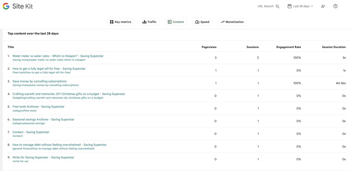
The user-friendliness of a website can influence its search engine ranking.
Search engines calculate usability in many ways, including correct use of hierarchy, mobile-friendliness, time spent on a page, where visitors go next and lots of other factors.
A website that’s difficult to use isn’t going to score well on any of those, which will impact how search engines rank it.
Increase Visitor Numbers
Improve your SEO and you’ll attract more visitors. Create a great experience when on your site and those visitors will return.
They may even tell others about your site or share it on social media.
Both can help widen your reach and increase visitor numbers. With competition for attention so strong, you have to do everything you can to attract visitors and turn them into regular readers.
Reduce Bounce Rate
Bounce rate is the measure of how many people land on one of your pages and leave immediately, or ‘bounce’ off the page.
We mentioned in the SEO section that search engines use time on page as part of ranking.
While time on page is important and the higher the better, the other side of that is also measured.
Too many bounces and your ranking can reduce as search engines will wonder why people don’t stay.
If people arrive and then immediately leave, is the page delivering what they are looking for or not? Search engines usually assume not, so won’t recommend your pages as often.
Elevate Brand Status
The user friendliness of a website directly contributes to how an audience thinks about a brand.
If you’re creating a business website, online store or eLearning site, that’s an incredibly important consideration.
Put yourself in the shoes of your audience. If a company can’t even get their website right, how confident would you be in their products or services?
How likely do you think it is that an order would be sent correctly or a product works as advertised?
People only do business with brands they trust. Create trust and you could create customers for life.
5 Effective WordPress Accessibility Strategies
Knowing the importance of user-friendliness is not enough. We now need to know how to make a website accessible and how to put that knowledge to use.
We won’t go into details as every website is different, but we will cover the basic WordPress accessibility principles you can use in your next project.
Use a Page Builder
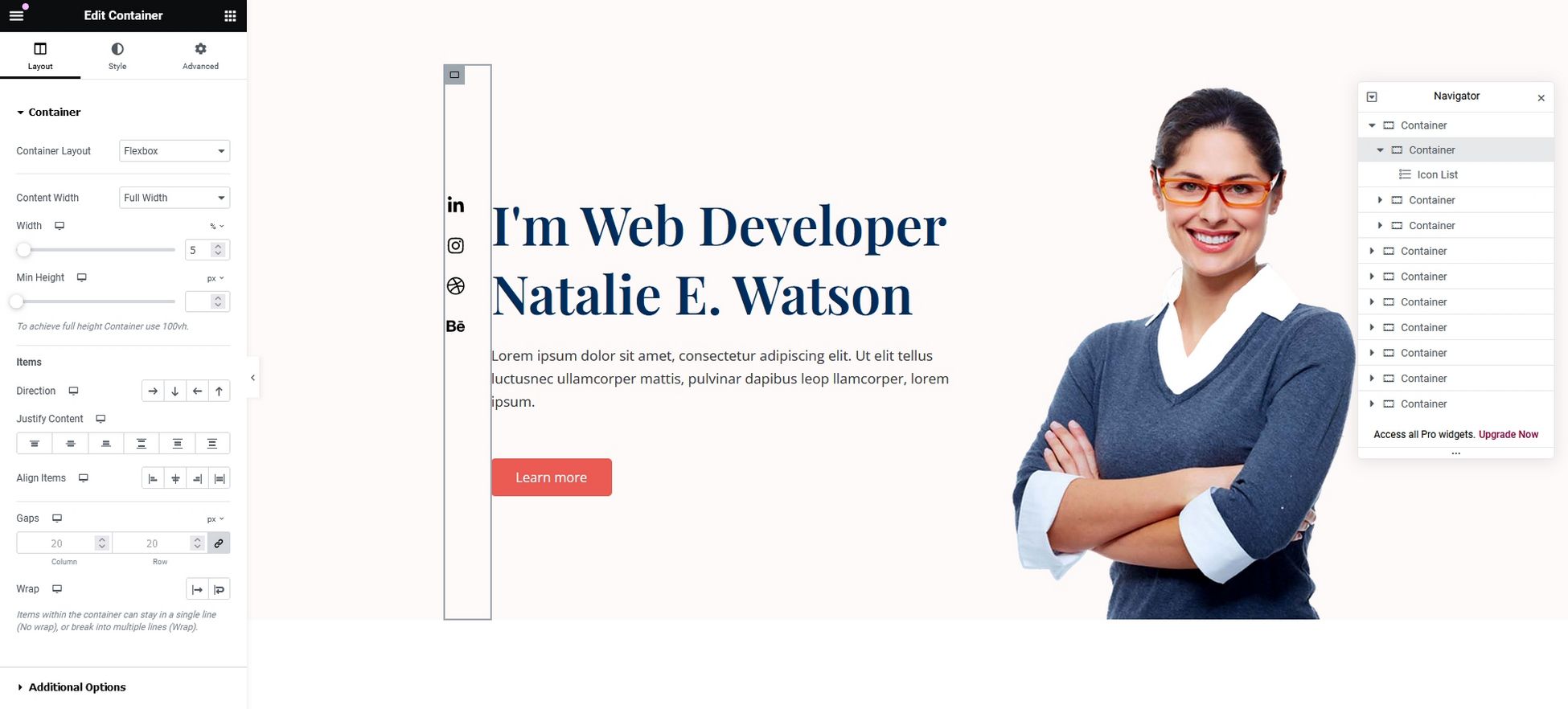
Page builders not only make it easier to build a website, they also make it easier to create accessible websites.
We know of 4 ways a page builder can improve accessibility:
- Organized page structure: Page builders use rows, columns, blocks and pre-built elements with a clear and organized HTML structure. This is crucial for screen readers and provides a coherent layout for all visitors.
- Built-in accessibility features: Many page builders offer features specifically designed for accessibility. They can include alt text to images, defined heading hierarchies (H1, H2 and H3), and support for keyboard navigation.
- Responsive design: Most page builders fully support responsive design. This makes them accessible on all devices, including those used by people with visual impairments.
- WYSIWYG editing: What You See Is What You Get editing allows you to see your website as it will appear to visitors. This makes it much easier to build logically and identify potential accessibility issues early.
Page builders such as Elementor and Spectra, and addons like Ultimate Addons for Beaver Builder, all have accessibility features built in.
They also work with readymade site designs like Starter Templates.
You can import a full website in seconds and customize it as you see fit safe in the knowledge you’re delivering an awesome user experience!
If you’re looking to go beyond the basics, custom wordpress development services can elevate your site even further. They specialize in creating tailored solutions that meet your unique needs whether it’s developing custom themes, advanced functionality, or seamless integrations.
Use QR Codes
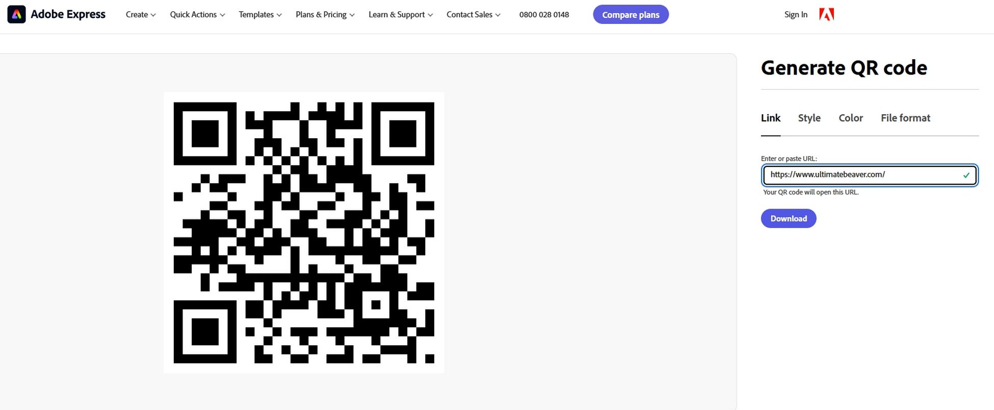
One often underutilized accessibility feature of the modern web is QR codes. Now in their second generation, they are proving very effective.
Here are 4 ways QR codes help website accessibility:
- Less typing: For people with dexterity issues or conditions such as dyslexia, typing long URLs can be frustrating. Creating QR codes allows visitors to scan the code for instant access to information.
- Screen reader alternative: QR codes aren’t compatible with screen readers but they can still help. They can simplify navigation and provide access to alternative pages more suited to their needs.
- Clear instructions: By including clear instructions alongside the QR code, it’s easy to understand what action the code performs. For example, ‘Scan to access menu’ or ‘Visit our screen reader-compatible page’.
- Freedom of access: QR codes printed on physical materials like flyers or packaging can also help. If a user doesn’t have an assistive device with them at the time, they can visit later.
QR codes on their own aren’t a aren’t a complete solution, but, used in conjunction with some of these other strategies, can make a difference.
Use Proper Headings
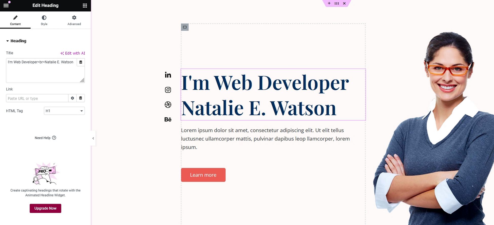
Page headings act like signposts, guiding visitors through content. They also help assistive technologies and SEO, which are added benefits.
Headings can boost accessibility with:
- Structure and hierarchy: Headings (H1-H4) establish a clear hierarchy of a page. This is crucial for screen readers and anyone who navigates by scanning headings.
- Improved scannability: Headings break up large blocks of text, making the page easier to scan and understand for everyone whatever their ability.
- Assistive technology: Screen readers use headings to give users an overview of page content. All users can navigate to specific sections based on those headings.
- SEO benefits: Clear heading structures not only improve accessibility but also make websites more understandable for search engines. This can lead to better search ranking, making the website discoverable by a wider audience.
By using headings correctly, you create a website that’s not only accessible but also user-friendly for everyone, regardless of their needs.
Be Careful with Color
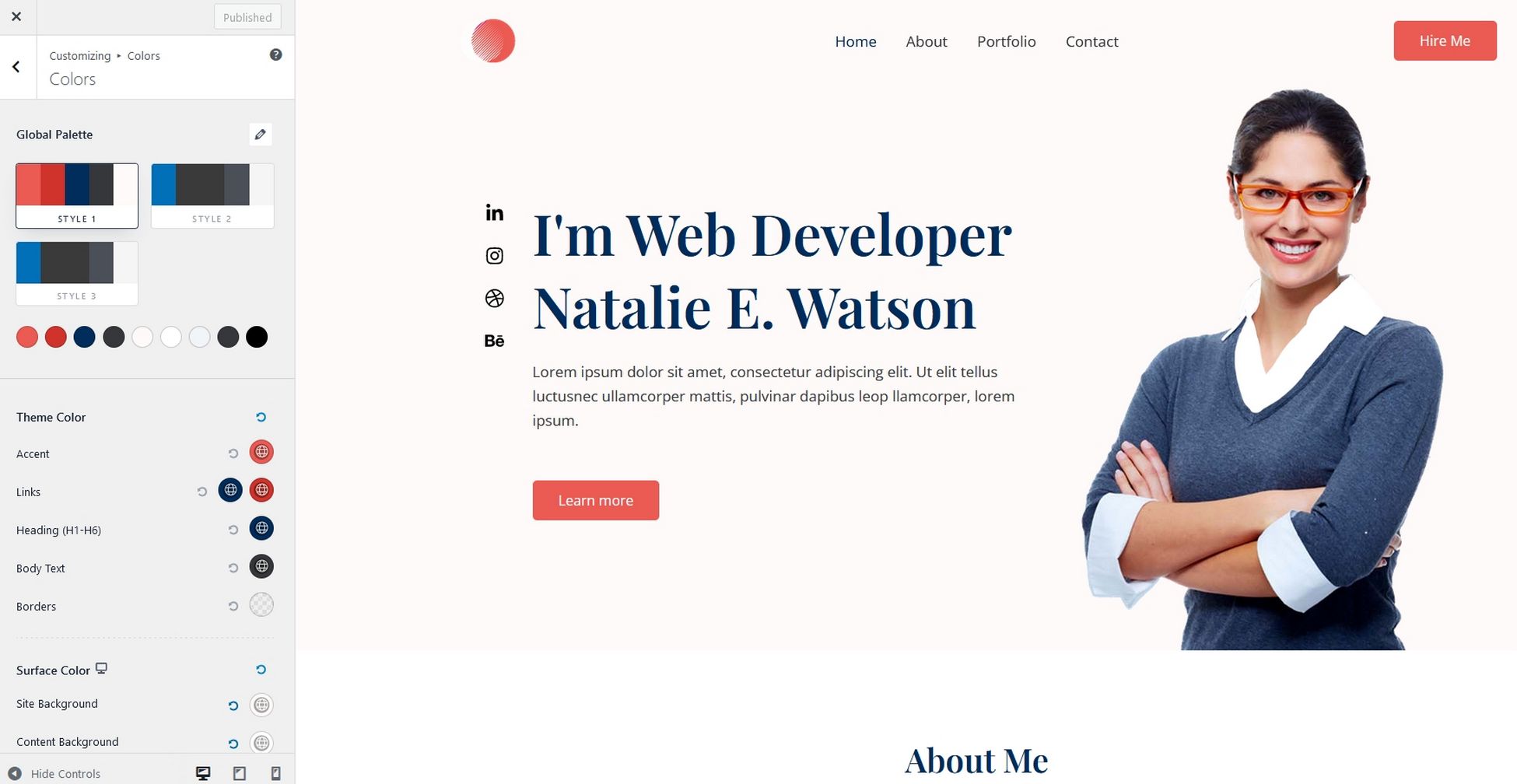
There’s a lot of science around color theory and how different combinations work.
Add accessibility into the mix and you have even more complications to contend with!
Here are some tips on how color impacts accessibility:
- Contrast is key: People with visual impairments, including color blindness, may struggle if the color contrast is low. For example, light gray text on a white background can be difficult to read for anyone, let alone those with vision issues. Using colors with sufficient contrast ensures everyone can easily use your site.
- Meaning beyond aesthetics: Color can convey information beyond looks. For example, red is often used for warnings and green for go or for success. This can be especially helpful for users who rely on color cues to navigate websites.
- Focus and user guidance: Color can be used to draw attention to important information or to guide users through a specific action. For instance, a bright colored button will stand out against a neutral background, making it clear how to perform an action.
As you can see, there’s a lot more to using color than branding!
Remember Mobile-Friendliness
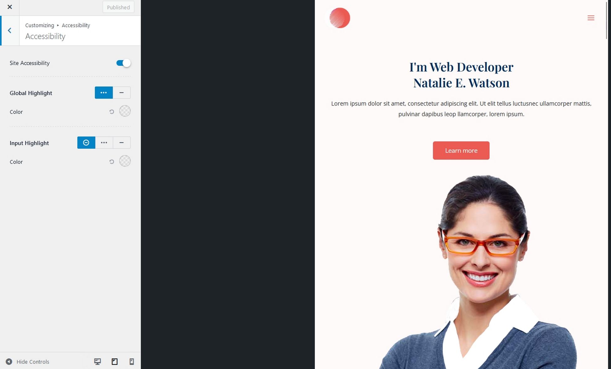
Responsive design helps a website cater to mobile audiences, but also has significant benefits for accessibility.
Here’s why:
- Simplified design: Mobile-friendly websites by their very nature have to use clean, uncluttered layouts. Less clutter means fewer distractions and easier interaction with buttons and menus.
- Responsive design: Responsive websites automatically adjust to different screen sizes and work with accessibility tools. This not only satisfies mobile first design, it also means users with specific needs can interact comfortably.
- Touch optimization: Mobile-friendly websites are optimized for touch, making them easier to use for those with dexterity challenges. Larger buttons, wider spacing, and focus indicators can all contribute to a more accessible experience.
- Compatibility with assistive technologies: Accessibility features like text zoom, voice control, and screen readers can all benefit from responsive design.
Use a responsive page builder, video presentation maker and other tools and you should be able to deliver a great user experience for everyone.
Enhancing Websites for User-Friendliness
When we talk about reaching the widest audience, we’re not just talking about SEO and attracting new customers.
We’re also talking about users with a range of different needs. Whether that’s vision, dexterity or something else, a website should be usable by all.
Fortunately, a lot of the same principles we use for good design and usability and mobile responsiveness also work for accessibility.
Follow the principles here and you’ll be able to deliver an accessible website that anyone, of any ability can use!
