Built with an online course in mind, this beautiful template can be tweaked to suit any event or a webinar you want users to register for.

Beginning with a catchy title and a call-to-action in the header, this template is sure to bring in a lot of conversions / registrations for you. The header section is followed by a section where you can speak about a feature or a highlight of the event.

You have two more sections as seen below. Here too, you can focus on a few features that you want your users or candidates to know. Built with an image and info boxes for content, these sections make a perfect row to flaunt a feature.


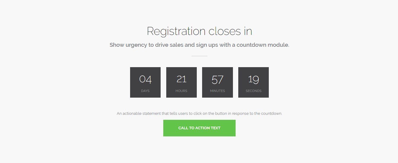
After having displayed your features, the next section is responsible to create a sense of urgency with a countdown module showing the time left for registration. Countdown modules often encourage users to act quickly without any hesitation.
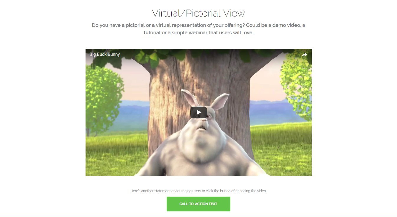
In order to make your page look a little more interesting and interactive, the next section allows you to embed a video on page. You can add a video tutorial or a virtual tour that will entice users to opt in for it.
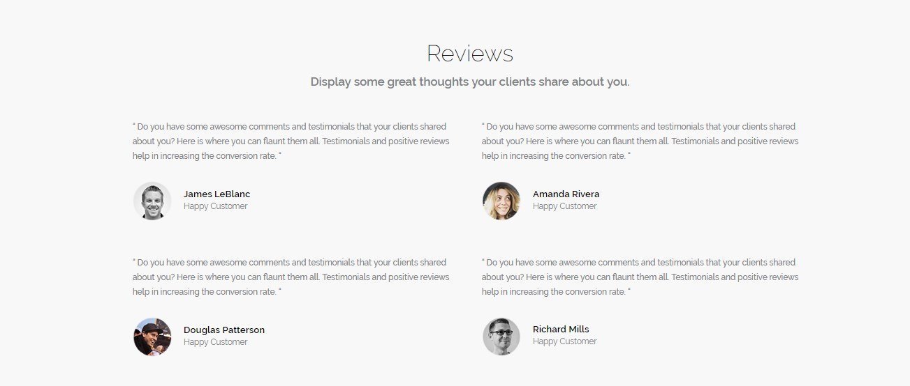
Then comes the time you should tell users about what you’re your past customers or attendees have to say about the event or course. This will surely encourage a lot more users to sign up!
Following this, you have a final chance to convince them. A final call to action with some catchy text and button will make up for the entire page.

Want to see this in action? Take a look at the template demo.
This template is a part of the Beaver Builder Templates in the Ultimate Beaver Templathon, a series that brings you 3 new templates every day.
Please feel free to share your feedback and thoughts in the comments below. We would love to hear from you!